

“So you’re designing yourself out of a job?” — Senior Developer | Elevate
Themes was built to answer exactly that: give clients enough self-serve ownership that most future website tickets wouldn’t need to land on us at all.
What Elevate Basic got wrong
Themes had a predecessor, Elevate Basic, and it had already tried to solve this — the same gap the sales interviews had surfaced. It looked dated, and it buried clients in configuration options they didn’t know what to do with — none of which made a site look custom. Clients still hired my manager and me anyway, because even with all those settings, Basic never closed the gap between technically customizable and looking like theirs. More choice was the wrong axis to fix.
Fewer starting points, real customization
So Themes made the opposite bet: three out-of-the-box templates instead of an open-ended layout system, with a settings layer underneath — color scheme, layout, logo, font, and advanced settings — for clients to make one of those three feel like theirs. Fewer starting points, but enough real personalization on top of each one that a client’s site didn’t read as a template with their logo dropped in.
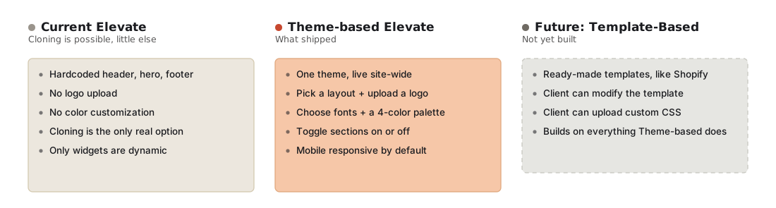
Mapping the shift — from Elevate's current, hardcoded sections to the theme-based system that shipped, with a further template-based future already sketched out but not yet built
Polishing the three templates
Sales gave us a shortcut early on: which existing client sites did they show prospects to close a deal? We’d designed over 100 LMS sites by then, so that one question did a lot of the work of narrowing down which layouts were worth turning into templates. From there, object mapping, wireframe concepts, and a gap analysis against competitor products turned into polished Figma designs for each template, with several rounds of iteration as the concepts firmed up.
Designing the theme manager
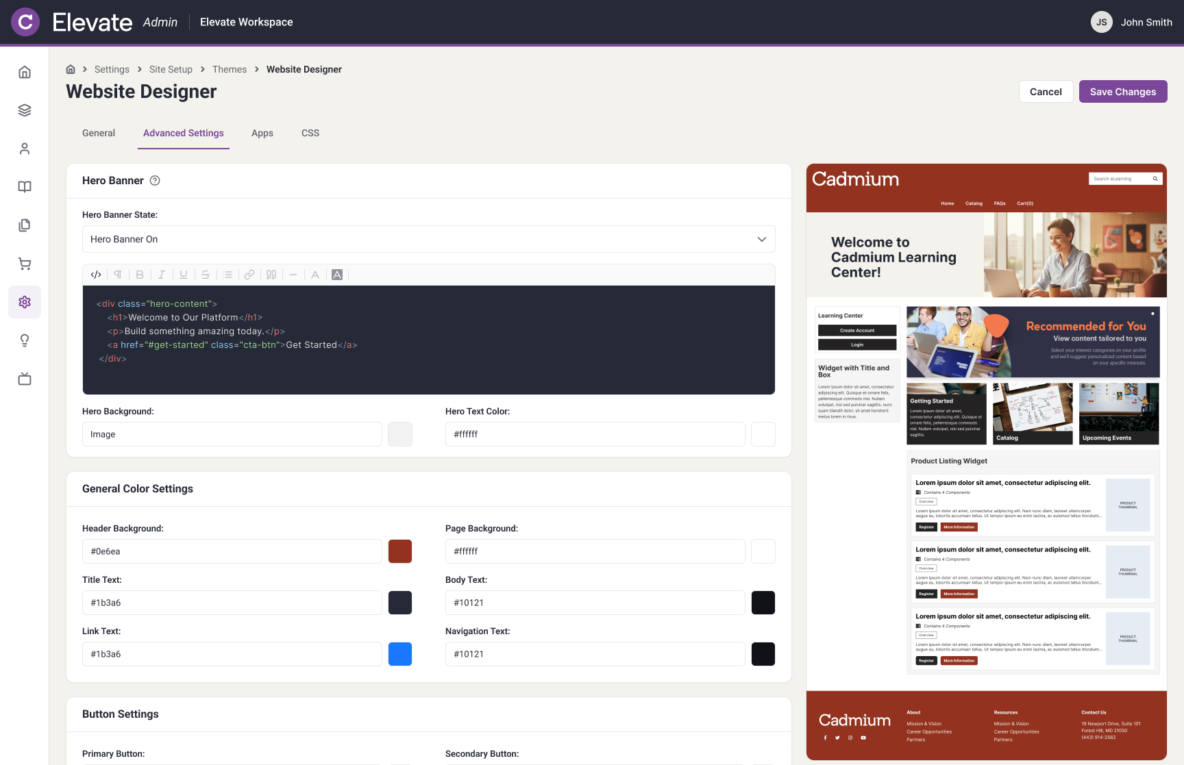
In parallel, I designed the admin side: the theme manager clients would actually use — general settings for structure (name, layout, menu, logo) and advanced settings for styling (colors, fonts, footer, and a custom CSS tab). That CSS tab mattered most: it let a client push past the three templates entirely, instead of settling for one of three shapes with their logo dropped in. It went through 3 iterations, shaped by sprint reviews with the PM and developer.
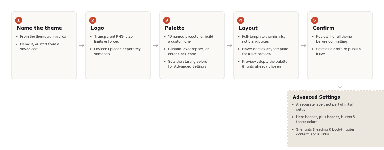
The theme setup flow — name, logo, palette, layout, confirm — with advanced settings kept as a separate layer clients could reach for later, not a required step
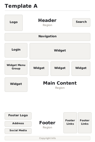
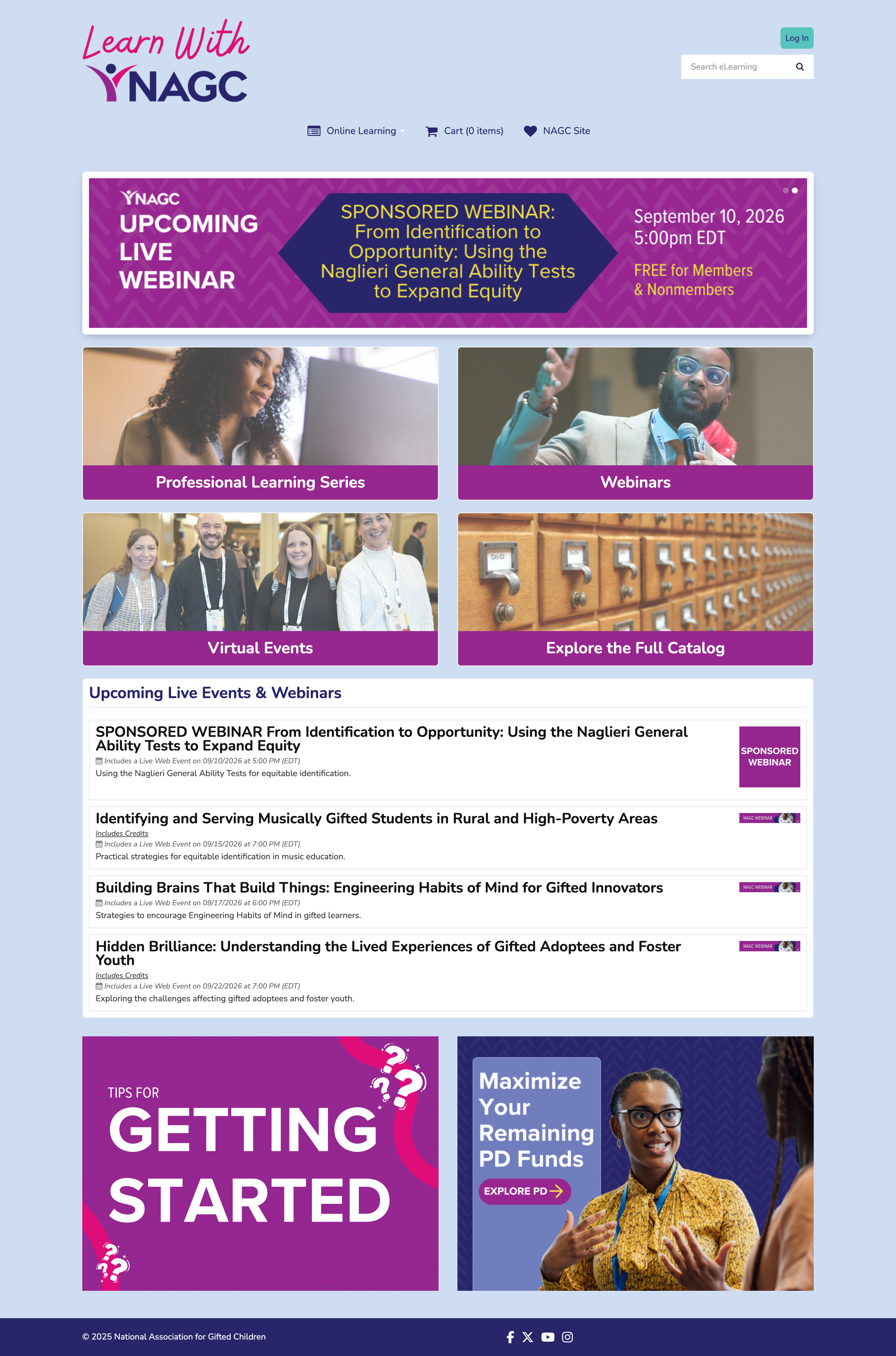
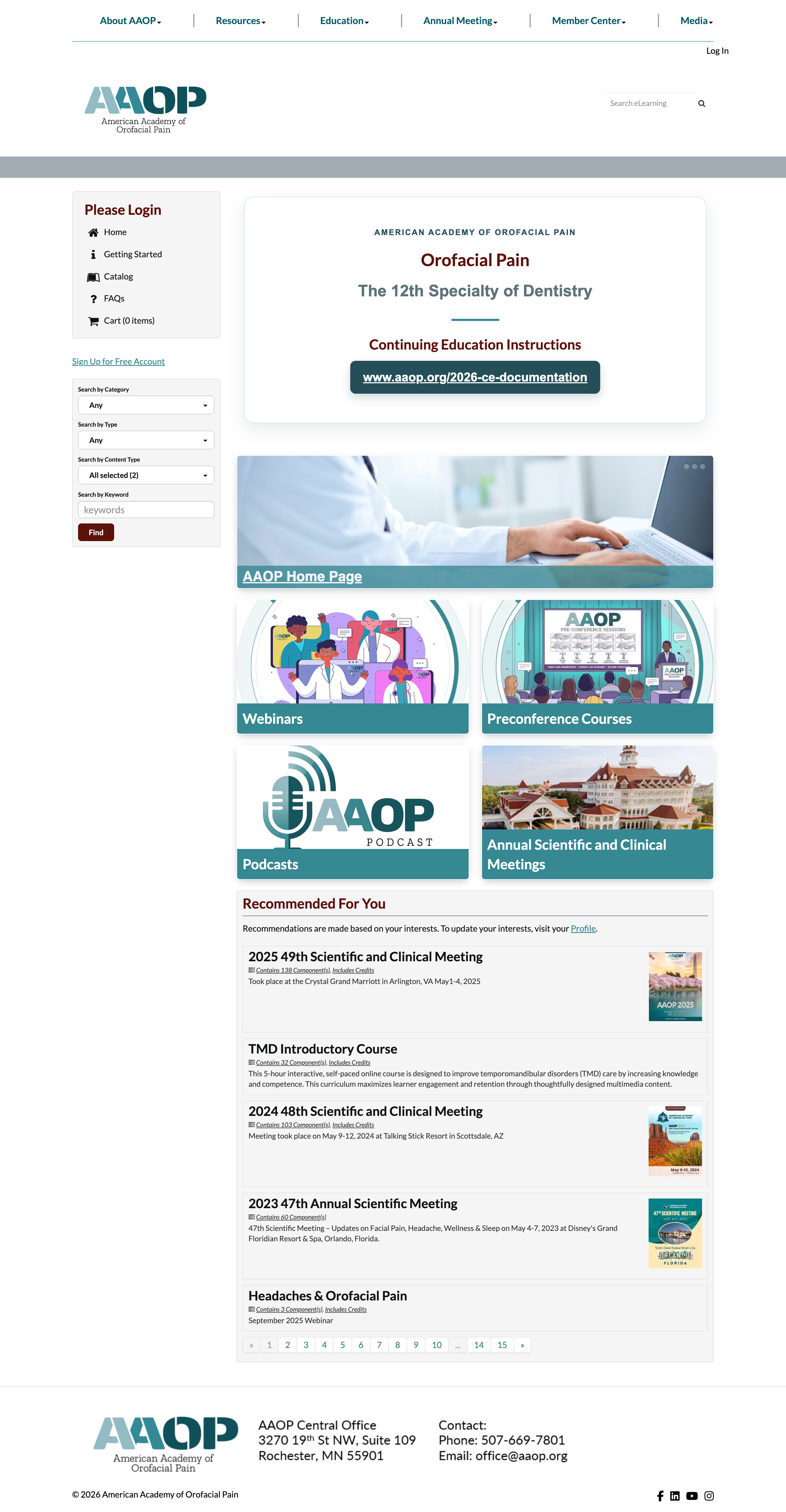
Template A — sidebar navigation, login, and widgets alongside the main content
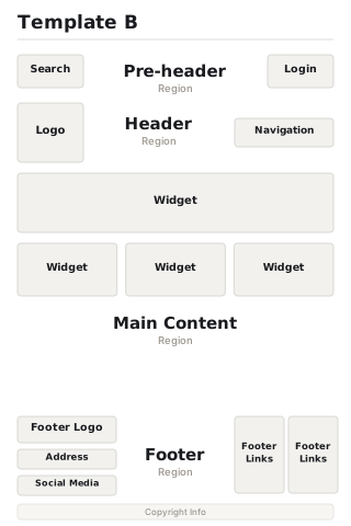
Template B — a pre-header strip and centered navigation, no sidebar
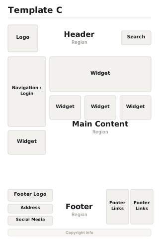
Template C — navigation and login merged into one sidebar block, main content widened
Auditing the settings layer
Before the theme manager’s settings could be finalized, I audited every individual color and style setting against the templates themselves — what it controlled, which region of the page it lived in, and whether it actually needed its own control at all. A good number of settings turned out to be redundant: hover states that should just read darker or lighter rather than carrying their own color picker, or values that could safely assume another setting instead of duplicating it.
What got cut
Consolidating those settings mattered for the same reason three templates beat an open-ended layout system: fewer knobs, but the ones that remained meant something. Button hover text, dropdown hover backgrounds, and menu item hover states all got cut from the settings list this way — kept as automatic behavior instead of one more decision a client had to make.
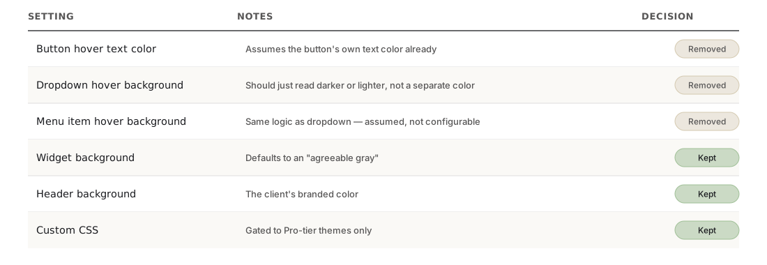
A working excerpt from the settings audit — not the final shipped spec, but the process of deciding what a client actually needed to control versus what the system could just infer
From Figma to code
The templates weren’t handed off to build — I built them myself in Visual Studio Code. I met with our senior LMS developer to scope how theme settings would actually reach a template: how color, font, and layout choices would be assigned through variable tags across the CSS and the Blade files (Cadmium’s client websites all ran on Laravel), and how I’d ship the finished work through git.
Testing before shipping
Before anything went out, I tested every template against my own Figma designs — checking that colors, fonts, and layout choices matched what I’d specified — and confirmed each one held up responsively across desktop, tablet, and mobile before it shipped.
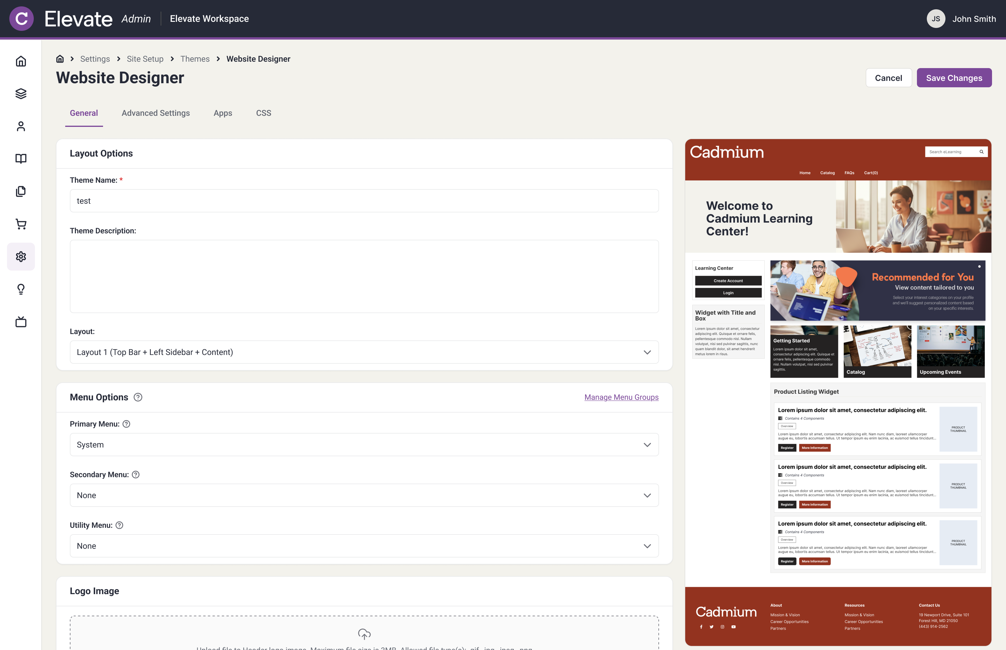
The General tab, live in production — theme name, layout, menu structure, and logo
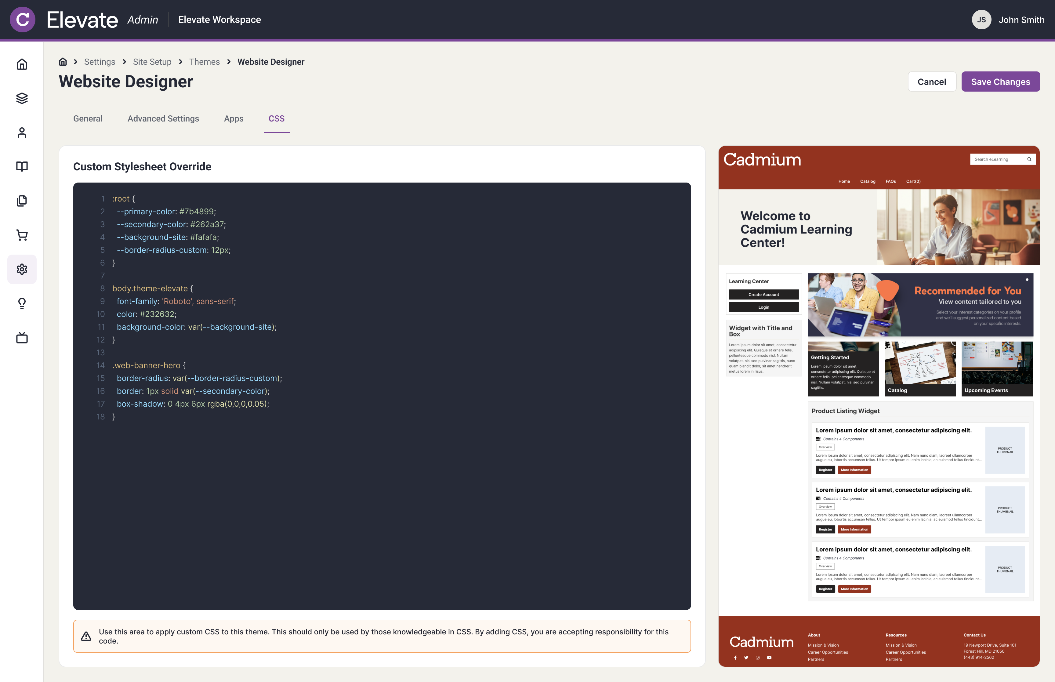
The CSS tab — a full stylesheet override, for clients who wanted to push past the settings above
Outcome
Elevate Themes shipped: three templates and a self-serve theme manager, live in production. Custom site builds dropped from 30 in the 13 months before launch to 6 in the first 8 months of 2026, cutting my manager’s and my manual workload by roughly two-thirds. From there, I worked with sales and client success to price Themes as its own product line — Elevate’s first time charging for site design separately from a flat contract.
“I especially love how they let me match our event color schemes, keeping our pages cohesive with our in-person events while still standing out from our regular catalog.” — a client, in feedback shared with our product manager
What I’d do differently
Sales interviews stood in for talking to clients directly — a shortcut taken because we were in a rush to ship, and the business overall skipped user interviews as a result. Sales knew the market, but they’re still a step removed from what a client actually needs. I’d push harder for direct interviews next time, even under deadline pressure, instead of letting sales feedback stand in for it.
Why this mattered
Landing on three curated templates instead of an open-ended settings list — and shipping the code myself — is what turned this from a service two designers kept absorbing for free into a product Elevate could actually sell.