
The discovery call
A discovery session with the product specialist who hand-built custom Word reports for clients exposed how rigid Cadmium’s stock templates were, how inconsistent the custom ones had become, and how central sorting and grouping submissions was to a usable report. The PM had already built a first-pass prototype to solve it, but its sorting and grouping didn’t hold up, and two dozen fields and settings all visible and clustered at once made it hard to use besides.
Two competing models
The hardest design question: how do you let someone configure a report like “group these by final decision, with a header above each group, sorted alphabetically inside it” — without exposing the complexity underneath? Two approaches competed to answer it: tiered sorting, which treats a group as just another level of sorting (cheaper, one template), against custom reusable blocks for each group (more flexible, but costlier to build and maintain).
Three sessions in, I said the real problem out loud: “What’s the difference really between groups and sorting?” Nobody could answer it — or the bigger question underneath, which our engineering lead put simply: “We’re trying to build a tool that’s simple enough, yet flexible enough. And those two don’t go together.”
The workshop that broke the deadlock
Instead of a fourth circular conversation, I turned the transcript of the one that went nowhere into a structured workshop — stated goals, named pain points, three options side by side.
It isolated the one variable nobody had named: headers on the second sort tier, which would force engineering to re-derive group boundaries. Once that was the only real disagreement, it got conceded — tiered sorting, custom order, headers at the top tier only, confirmed as substantially less work.
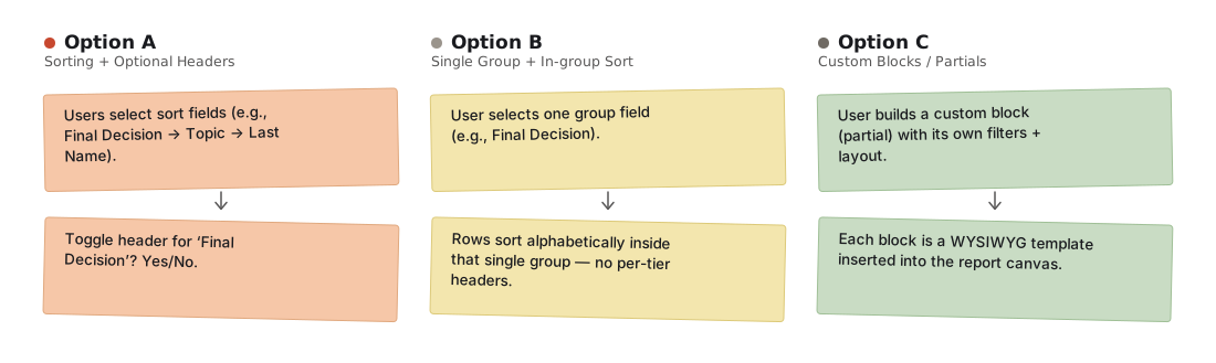
Step 1 — mapping each option's workflow, sticky note by sticky note, before scoring any of them
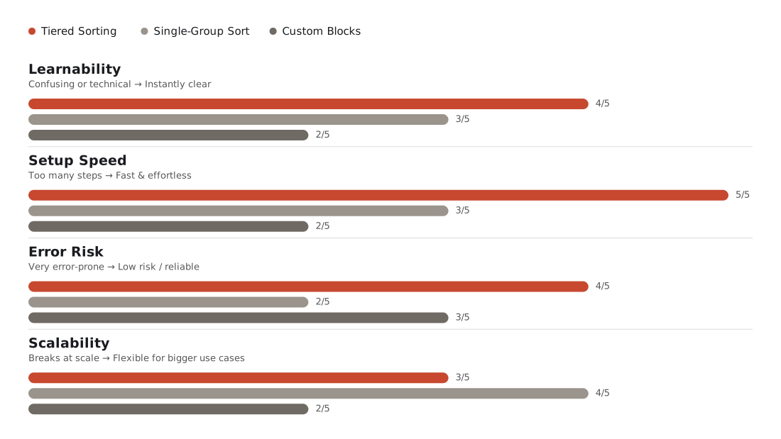
Step 2 — scoring the three options on learnability, setup speed, error risk, and scalability to isolate the one real disagreement
Building the prototype
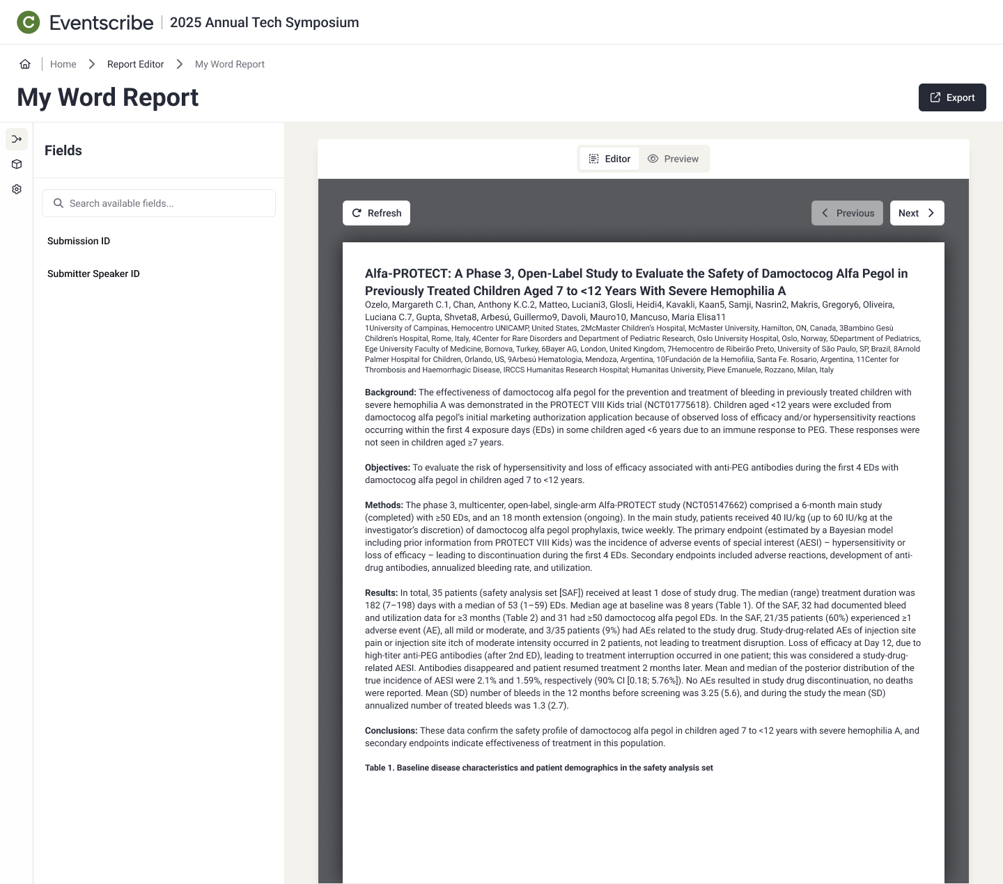
I rebuilt the prototype myself in Figma Make, feeding in my own designs rather than prompting from scratch. V2 moved editor and preview into tabs and swapped per-field toggles for an overflow menu once the field count got cluttered.
Validating with real users
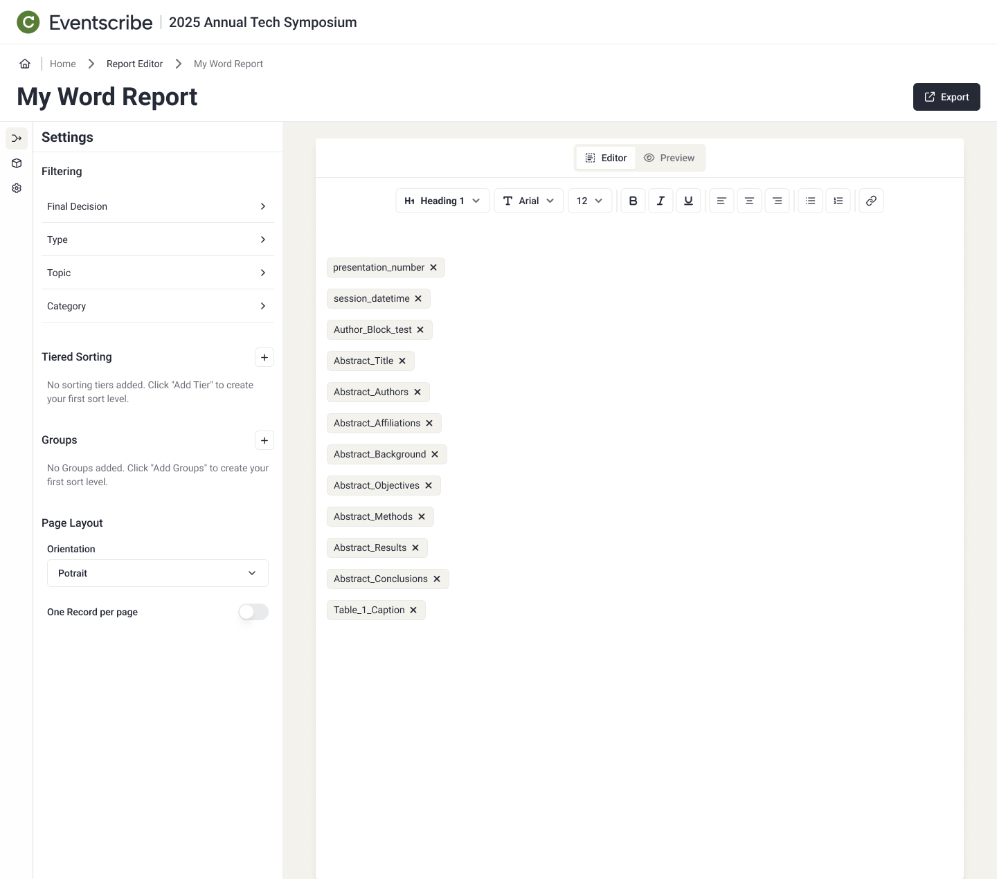
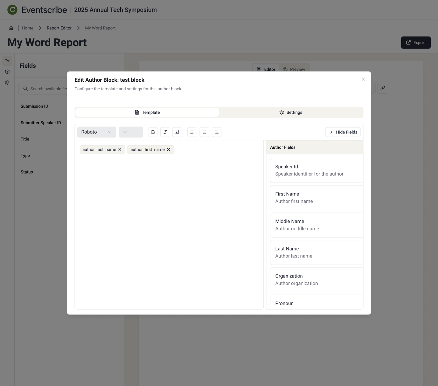
Five non-technical employees tested the prototype. It held up structurally, but surfaced two concrete gaps: nobody discovered the toggle for hiding per-field labels, and half the group never found the author-separation setting, typing semicolons by hand instead.
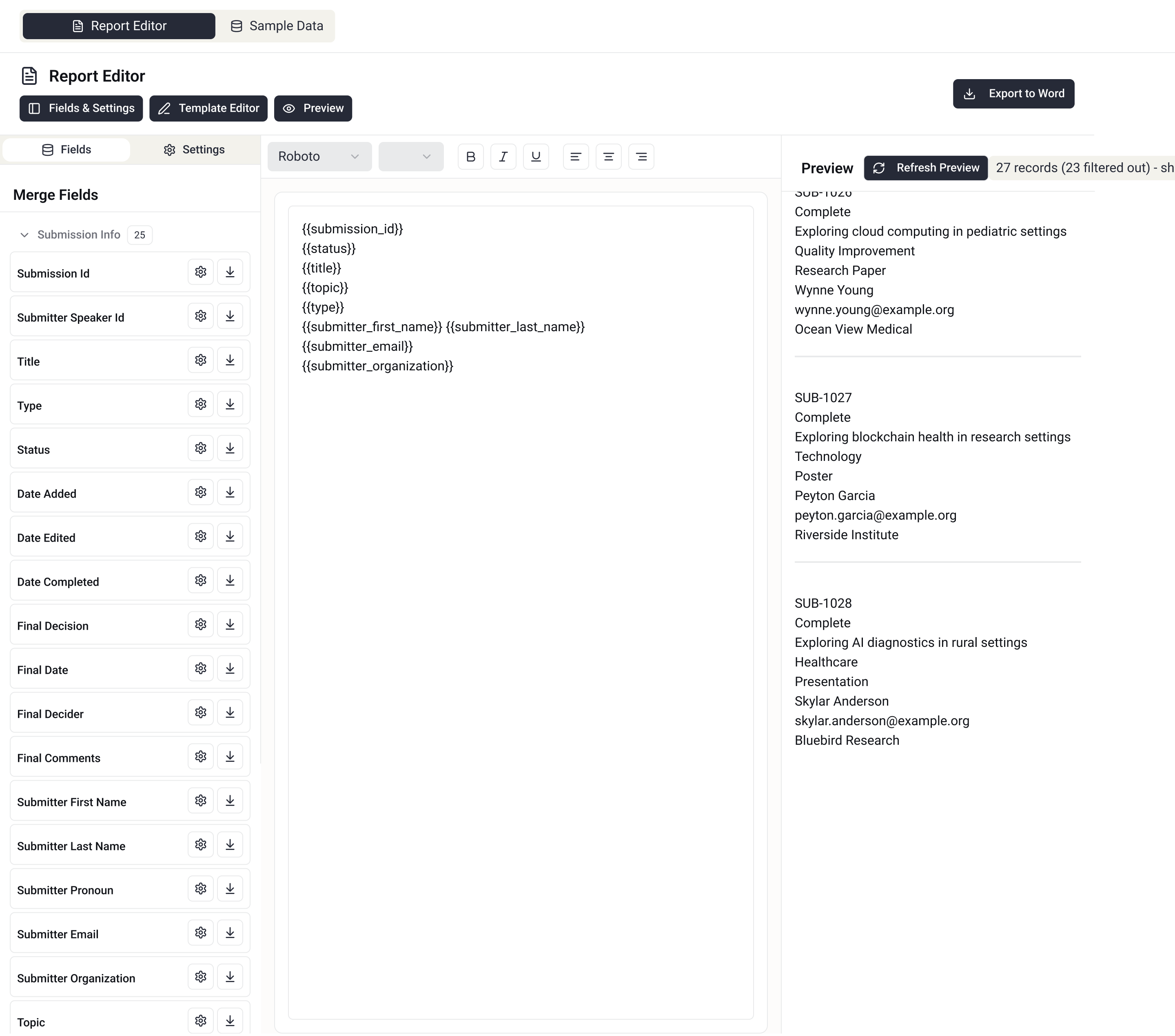
V1 — two dozen fields, each carrying its own settings and download icon, all visible and clustered in one long list.
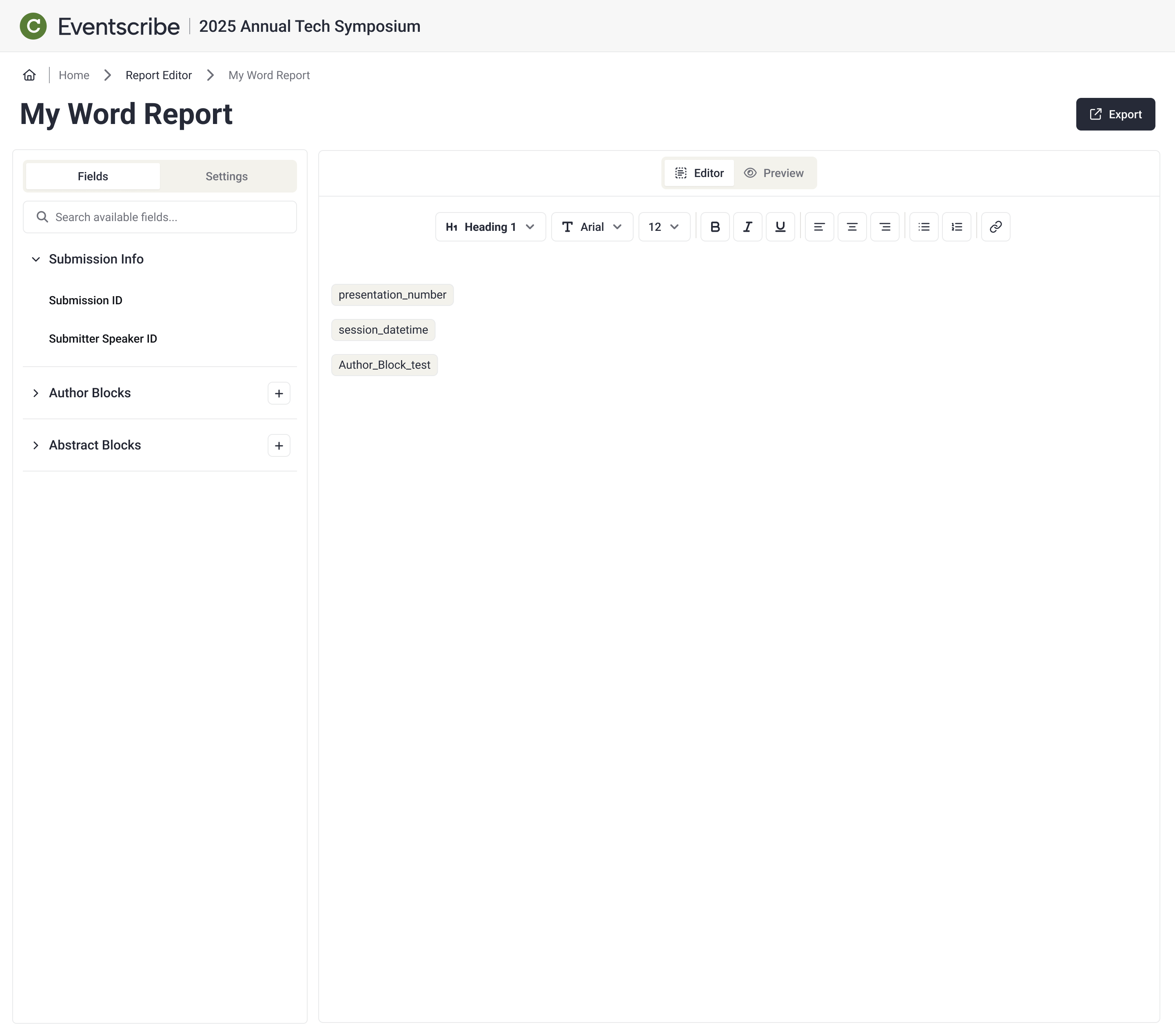
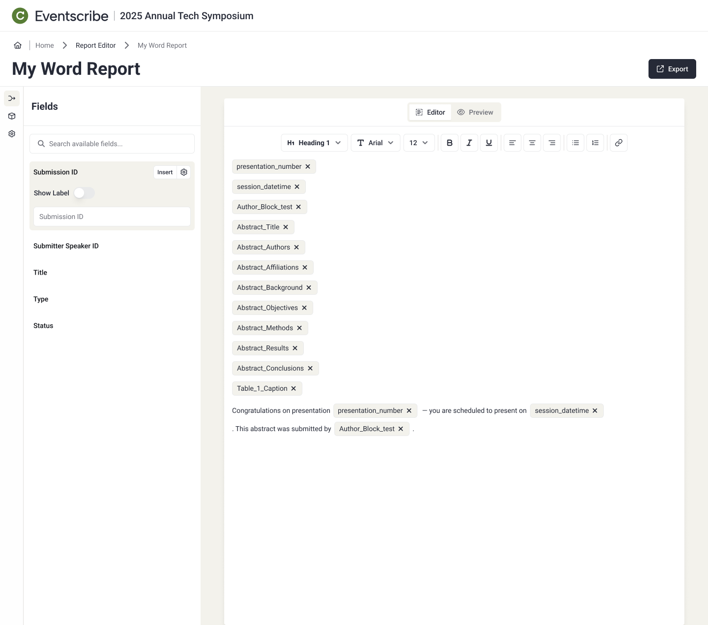
V2 — fields collapsed into searchable, browsable groups, with settings tucked out of the way until needed.
Stress-testing merge-field insert
With structure settled, the question was how to insert merge fields into a blank report. I ran a black hat session — timed sticky notes, then AI-assisted clustering — to break three options, not just walk through them. Usability testing had already killed two of them outright: both leaned on a hover-then-ellipsis pattern people couldn’t find. A drag-handle option was also rejected, for reading as reorder and hurting accessibility. The group converged on Quick Insert: a hover-revealed split button, refined to swap the chevron for a gear.
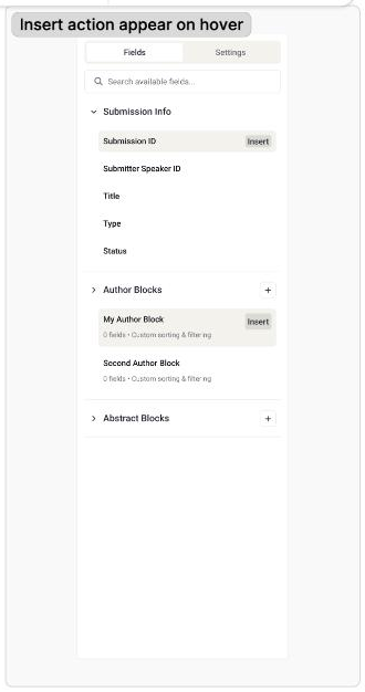
The group liked how clean this looked, but felt hiding the Insert action behind hover made it hard to find, and raised real accessibility questions.
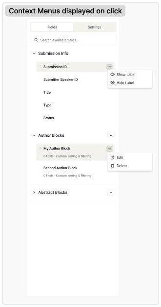
Rejected outright — user testing showed people didn't discover the ellipsis menu, and there was no accessible, keyboard-based way to do the same thing.
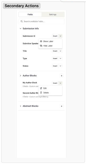
Felt busy — too many buttons, "Insert" repeated on every row — but the smaller footprint won out. This became the pattern the group converged on, later refined with a hover reveal and a gear in place of the chevron.
What the critique surfaced
Two constraints that should have surfaced in September came out here instead: the rich text editor treats merge tags as plain text, not atomic blocks — a tag inside another tag could silently break — and there was no accessibility answer for a WYSIWYG insert flow.
I prototyped the embed-based approach myself, confirmed the corruption bug was solvable, and caught and fixed a second bug — embeds forced tags onto their own line, breaking anything meant to sit mid-sentence — before handoff.
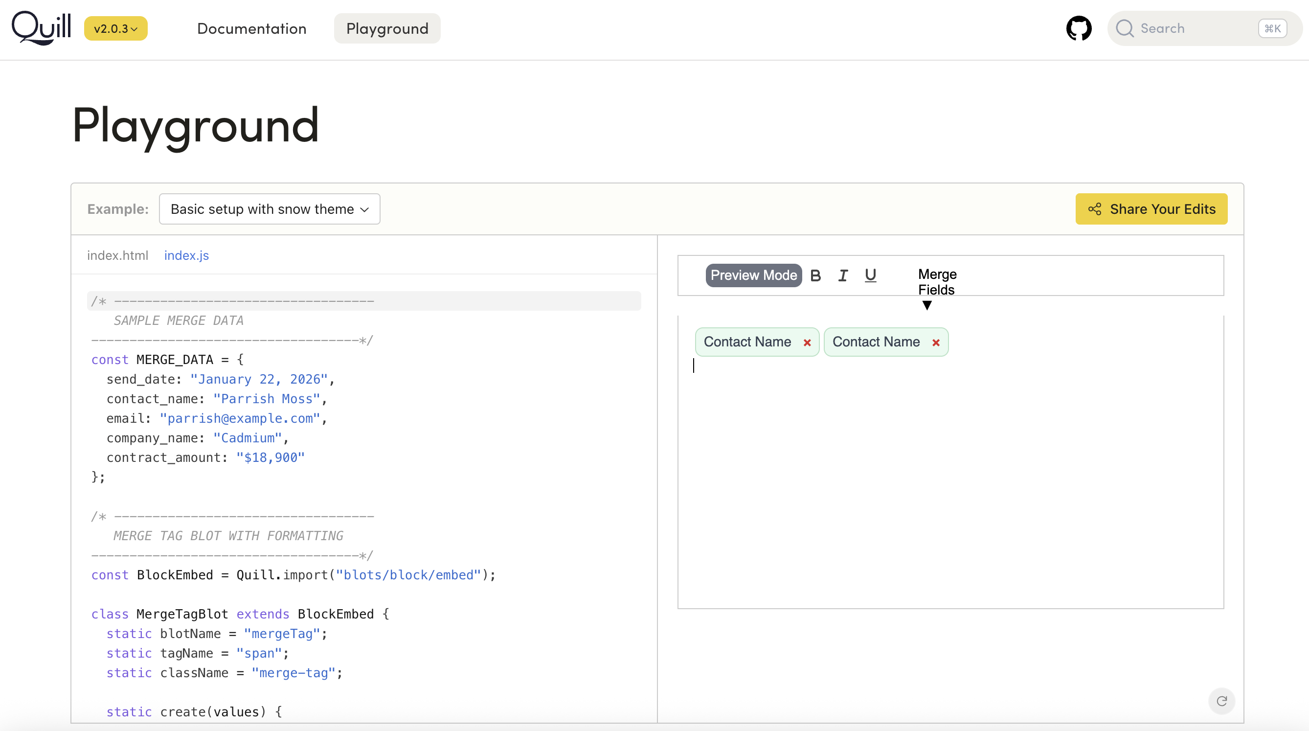
Quill playground — the merge tag running live as a block embed, removable as a single unit, confirming the corruption bug was structurally solvable
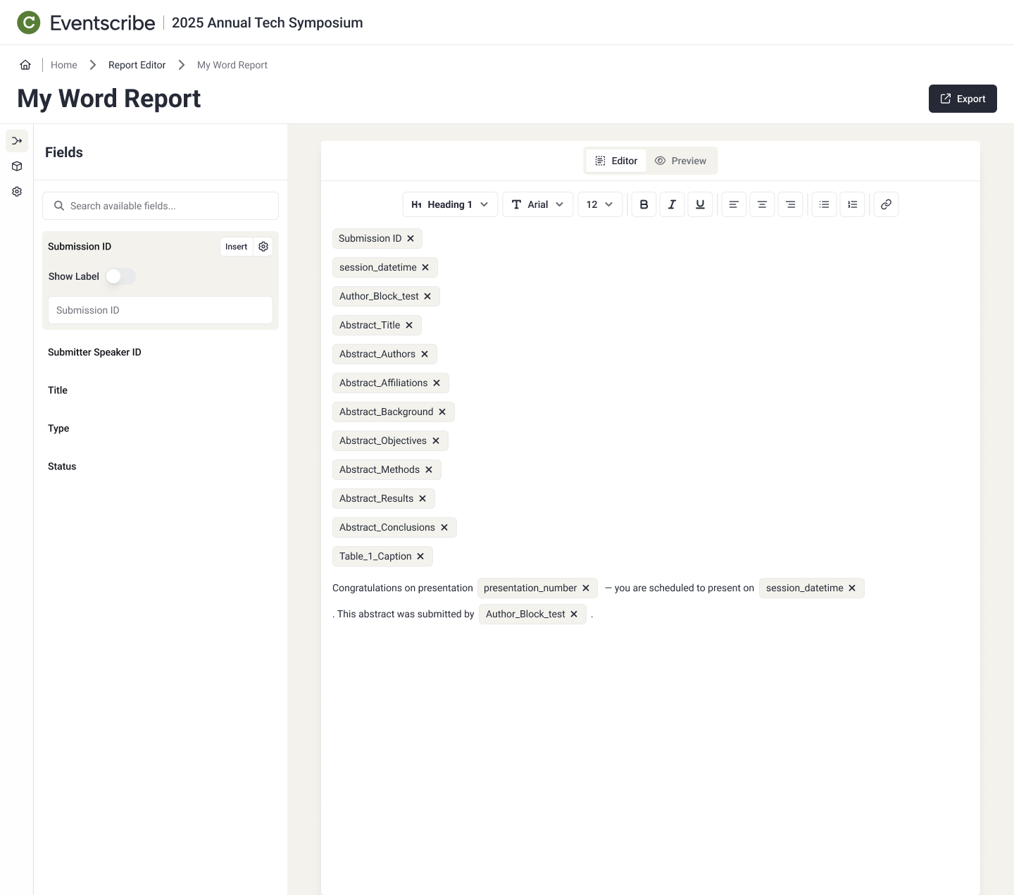
Quick Insert, live in the report builder — fields land as removable chip blocks in the document, the same pattern validated in the Quill playground
Outcome
By December, the design had converged — validated, prototyped, ready to build. What never got resolved was the question above the design team’s pay grade: how far Cadmium should go in replacing a human reporting service with software. The project went on hold, and that stall — plus cost data the company already had — became the basis for a later pivot: a smaller set of stock reports, deliberately scoped to be cheap to build, with truly custom work pushed to a paid tier instead.
What I’d do differently
I would push to validate with real users before locking into a specific model. Option A got chosen on dev cost and maintenance alone; the question of whether customers actually needed tiered grouping got asked twice and never answered, which meant we validated an assumption instead of testing one.
Why this mattered
No feature shipped out of this phase. What did was a months-long argument turned into a decision, and a structured critique turned into a business conversation nobody was ready to have in September. The custom sort proposal, the workshop that isolated one variable, the black hat session that carried testing’s evidence into the room instead of re-deriving it, and the fix built from that critique afterward — none of it required more authority than I had, just the right method for the decision in front of it. When the organization couldn’t answer what this process kept surfacing, that evidence became the basis for the strategy shift that followed.